


The role of dataviz in this moment in history, Virtual Coffee Breaks, and the DVS State of the Industry Survey Challenge
Newsletter, February 2024

Viz block. Like writer’s block, but sub dataviz for writing. I have it.
Here we are, nearing the end of February and I haven’t published a single public viz this year. Not for lack of interesting projects to work on. My backlog could easily keep me occupied for two years.1
The viz block might be partly related to my perfectionistic tendency to overwork, so maybe I am just fucking tired. But I believe most of the reason is related to the sobering, heartbreaking state of the world. The violence. So much violence and unnecessary killing. Two incredibly significant global conflicts. More gun violence here in the United States. Climate change. The very real possibility that we Americans might elect Donald Trump to the presidency AGAIN?!? 🤯 What is wrong with us?
How do we, as humans and data practitioners, grapple with these challenging, polarizing topics? Should we? (Yes.) What is the best way we can individually contribute something meaningful? We can’t allow despair to overtake us, and we cannot allow ourselves to become numb to these horrifying realities.
Amidst all this sadness and conflict and tragedy, data visualization practitioners Federica Fragapane and Mona Chalabi have responded with stunning data visualizations on Instagram.
In a series of three simple but impactful views, Federica Fragapane, a brilliant information designer based in Italy, communicates the severity of the crisis in Rafah with a visual vocabulary we can all understand. (If you’re in NYC, go check out Federica’s work in the permanent collection at MoMA.)


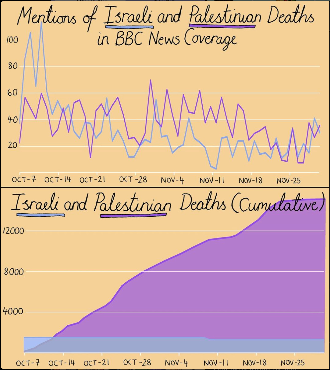
The Guardian data editor, illustrator, and writer Mona Chalabi won the 2023 Pulitzer Prize in Illustrated Reporting and Commentary for her piece 9 Ways to Imagine Jeff Bezos’ Wealth, published in the New York Times Magazine’s Money Issue. Check out her Instagram for many examples of visually striking hand-drawn visualizations about topics ranging from Wordle to affirmative action to domestic violence. (She was also a guest on the Longform podcast in November.) The viz pictured below contrasts the BBC News coverage of Israeli deaths and their coverage of Palestinian deaths in the war in Gaza. The difference is staggering and especially sobering in the area chart view of cumulative total deaths.
The work of these remarkable women reminds me of one of my favorite reasons why I love data visualization—it allows us to grapple with any topic for which we can find—or make—data, and helps us understand complex topics more deeply and more viscerally.
📆 Upcoming Events
🏔️ Data Careers Summit
Friday, 2/23, 10 AM - 1 PM EST
Brandi and Dustin put together an incredible lineup of speakers from diverse backgrounds and areas of practice once again! The incomparable Eva Murray is the keynote speaker. Learn more and register.
☕️ Virtual Coffee Breaks
Thursday, 2/27 and Wednesday, 2/28
A super-low-key, informal, absolutely-zero-pressure social event. Every sixth Thursday, 8 to 9 AM EST, and every sixth Wednesday at noon EST. See our Community Calendar for more details.
📊 DVS State of the Industry 2023 Survey Challenge
Now through March 31, 2024, analyze and visualize the Data Visualization Society State of the Industry Survey data from 2023. Learn more and submit your entry.
🎙️Outlier 2024 Call for Speakers
Speaking of DVS, they’re hosting Outlier in Chicago this year, June 12-14. Learn more about the conference and apply to be a speaker through Feb. 24.
👀 Perspectives
Granularity and Visual Patterns, Enrico Bertini
How often have we assumed that more granular data is “better”? Enrico Bertini challenges this notion in his thoughtful exploration of how granularity affects visual representation.